Archdiocese of Toronto: Difference between revisions
Knorrepoes (talk | contribs) m (Text replacement - "{{religion}}" to "") |
Knorrepoes (talk | contribs) No edit summary |
||
| Line 48: | Line 48: | ||
File:Toronto-carter.rel.jpg|[[Gerald Emmett Carter]] (1978-1990) | File:Toronto-carter.rel.jpg|[[Gerald Emmett Carter]] (1978-1990) | ||
File:Toronto-ambrozic.rel.jpg|[[Aloysius Ambrozic]] (1990-2006) | File:Toronto-ambrozic.rel.jpg|[[Aloysius Ambrozic]] (1990-2006) | ||
File:Toronto-collins.rel.jpg|[[Thomas Christopher Collins]] (2007-present) | File:Toronto-collins.rel.jpg|[[Thomas Christopher Collins]] (2007-2023) | ||
File:Toronto-leo.jpg|[[Frank Leo]] (2023-present) | |||
</gallery> | </gallery> | ||
Revision as of 04:50, 26 March 2023
ARCHDIOCESE OF TORONTO (Archidioecesis Torontina)
Country : Canada
Denomination : Roman Catholic
Established : 1841 as Diocese of Toronto
Elevated 1870 to Archdiocese of Toronto

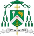
Official blazon
Origin/meaning
A diocese is the basic grouping of the Church - the people of God - under a bishop. In its very nature, the grouping is of many people, many vocations, many ministries, each with characteristics, and personalities. In this way, the sharp ‘edges’ and awkward ‘shapes’ of each person, institution, and ministry who come together to form a pattern of inter-supporting cooperation. These diamond shapes are the basis of the design. The diamond shapes, like humans, which when fitting in well with each other make up a composite whole.
The colours of red and white represent Canada and may be taken as symbolic of the great effort, the blood and sweat required to bring together and forge the unified effort of this section of the people of God, formed into a diocese.
Across the design is placed the spear and shaft of St. Michael - the popular patron of the diocese. This spear overcomes and controls the dragon’s head, symbolic of the Devil. The shaft has its upper end formed as a cross - the symbol of Christianity and so of man’s redemption - and attached to the cross are three gold maple leaves, symbolic reference to the Province of Ontario.
Between the arms are rays of light, is an additional allusion to St. Michael the Archangel whose light overcomes Lucifer. As these rays are curved - arched - this provides a subtle pun by the heralds on his archangel status. The mitre on top of the shield symbolizes that this shield belongs to a diocese.
The previous arms (used until ??)

The arms shown in the booklet for the inauguration of Bishop O'Connor in 1899:

The arms of the diocese in 1892 as shown in a booklet of the 25th anniversary of Bishop Walsh:

Arms of Bishops

Michael Power (1841-1847)
Armand-François-Marie de Charbonnel (1850-1860)
- No image
John Joseph Lynch(1860-1870)


Arms of Archbishops
John Joseph Lynch (1870-1888)
John Walsh (1889-1898)
Denis O'Connor (1899-1908)
Fergus Patrick McEvay (1908-1911)
- Toronto-mcneil.jpg
Neil McNeil (1912-1934)
James Charles McGuigan (1934-1971)
- No image
Philip Francis Pocock (1971-1978)
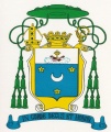
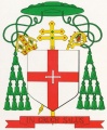
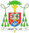
Gerald Emmett Carter (1978-1990)
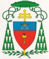
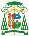
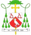
Aloysius Ambrozic (1990-2006)

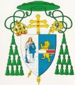
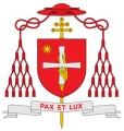
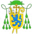
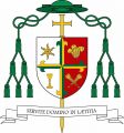
Thomas Christopher Collins (2007-2023)
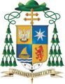
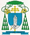
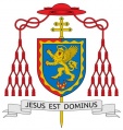
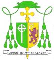
Frank Leo (2023-present)


Arms of Auxiliary Bishops
Thomas Timothy O’Mahony (1879-1892)
Francis Valentine Allen (1954-1977)
- No image
Aloysius Matthew Ambrozic (1976-1986)
- No image
Nicola de Angelis (1992-2002)
- No image
Daniel Joseph Bohan (2003-2005)

John Anthony Boissonneau (2001-present)
- No image
Robert Bell Clune (1979-1995)
- No image
Thomas Benjamin Fulton (1968-1978)
Richard John Grecco (2002-2009)
- No image
Peter Joseph Hundt (2006-2011)

Robert Michael Kasun (2016-present)
Wayne Joseph Kirkpatrick (2012-2019)
John Stephen Knight (1992-2000)
Michael Pearse Lacey (1979-1993)
- No image
Francis Anthony Marrocco (1955-1968)

William Terrence McGrattan (2009-2014)
- No image
Anthony Giroux Meagher (1997-2002)

Vincent Nguyên Manh Hieu (2009-present)
- No image
Terrence Thomas Prendergast (1995-1998)
- No image
Leonard James Wall (1979-1992)
- No image
Benjamin Ibberson Webster (1946-1954)
Ivan Philip Camilleri (2020-present)


This page is part of the  Ecclesiastical heraldry portal

 Catholic heraldry
|
 Other Christian churches |

|